5.3.1 - Exercise: Giving information
- Amber Houbara

- Jul 17, 2020
- 7 min read
Updated: Jan 8, 2021
Find some examples of information graphics.
For example bus timetables, city maps, diagrams or representations of statistical data.
Look at the way they are designed and try and work out the decisions the designer made.
What can you learn from them?
and when would it be appropriate to use a similar design solution?
For this exercise you are going to describe your immediate surroundings using information graphics;
this could be a plan of your desk, the layout of your house, the arrangement of objects in your cupboards or your morning journey;
anything will do.
Before you start
you will need to think about scale
and about how you will break down the information for your design.
Create a graphic that represents an aerial or front on view of your location.
Be mindful of
the hierarchy of the elements in the composition
and the dynamics needed to draw the viewer’s eye from one stage to the next.
Use
typography,
numbers
and colours
to describe what is being represented.
You may want to produce a key to help us understand what is being shown,
as well as a diagram title to put things in context.
Keep all your sketches and notes in your learning log.
Research
I have started by creating a board on Pinterest.
Then I took few examples to delve deeper into the idea behind the design.
I was taking a couple of courses on Skillshare to learn better about information graphic design, one of them was 'Beginning Infographics: Information-Driven Storytelling' by Liz Meyer & Gavin Potenza
They have spoke about 3 based types of information graphics -
Time
Location
Hierarchy
According to this article, there are actually 12 types (when delving deeper into the method of infographics)-
Data Centric, Timeline, How To, Geographical, Comparison, Hierarchical, Flowchart, List, Anatomical, Visual Resume, Photo-Based, Interactive
So I decided to view some of the ideas I've collected and categorize them first -
Time
decisions the designer made
Left - using a circle timeline, There is a lot of information here, and the only way to make it attractive enough was to put it on a dynamic circle timeline. it also has small elements such as the hierarchy at the top left which is another 'type'.
right - using a combination between a timeline, a graph, and images as the measuring elements in the graph
What can you learn from them?
That I can mix different types such as time and graph in my designs
when would it be appropriate to use a similar design solution?
when I have information that can suit 2 or more or when my complimentary info can go into smaller other types.
Location/ Geographical
decisions the designer made
left - it is a great infographics, the readers want to know how to get from earth to mars, there's a dynamic to it, we know the start and end point and the way to get there is explained very easily and pleasent to the eyes. It's a front-on view and there's a slight feeling that Mars is slightly further away.
Right - This is a very interesting and minimalistic design, we know it is a bicycle infographic and there is a great dynamic fun feel to it, it is as if there's a marathon or a competition, the design is blurry from my source but we can see that there's enough information next to each circle so it represents maybe a town and the statistics of bicycles in it.. It is an aerial map design so we can see the location from above.
What can you learn from them?
Left - I can learn how to use a dynamic feeling of a journey and how to use front-on in design.
Right - I like the way the information is packed and organized small, and the visual is what really attracts us to go further and read it. Also how to use aerial designs.
when would it be appropriate to use a similar design solution?
When describing a location-based information.
Hierarchy
decisions the designer made
Left - This hierarchy design is also a 'how-to' it has into pre-defined levels, and it teaches the reader how to go through the process of making a Korean egg roll. The designer have used a step by step guide putting the most crucial and challenging part of the recipe in the center and big. the illustrations are cute and appealing and giving us an invitation to read more.
Center - again here a guide that goes by order, this time top to bottom to give us information about ice cream, it is fun, funny, and cute.
Right - here is an interesting one, again there's a dynamics from top to bottom describing a process of making wine with water and energy, it is very nice to see the amount of information being big but more interesting then intimidating. It has the keywords bold and big so we know what we are going to read in each section.
What can you learn from them?
Here are some clear examples of the dynamics needed to draw the viewer’s eye from one stage to the next. It is also great to see how to show a big amount of information in a way that is fun and not overloading.
when would it be appropriate to use a similar design solution?
When there is a process, when there's a big amount of information, and when our text is a 'how-to'.
Before you start
you will need to think about scale
and about how you will break down the information for your design.
Create a graphic that represents an aerial or front-on view of your location.
Other courses I've taken on skillshare were -
(Which I've learned new skills on illustrator as well)
and
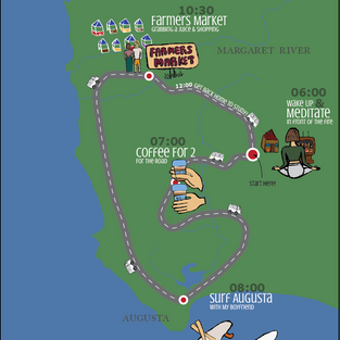
I chose to do an infographic based on my morning journey
First I wrote my data for my morning journey -

Sketching the idea
Then I started sketching.
It was very easy for me to think about how to arrange my morning journey 'time based' but I was trying to stick to my brief which requires a location-based infographic.
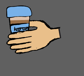
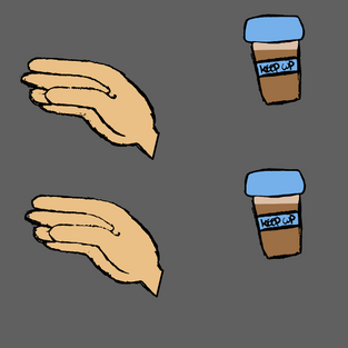
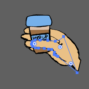
I was thinking a lot while watching the courses and came up with an idea, based on a map, show the locations I have stopped in and show with illustrations what did I do there. Use like a hand holding coffee take away or legs surfing and place them on the map, a little bit like kids illustrated maps (source Pinterest)
Then I was thinking further about problem-solving -
How to show the flow?
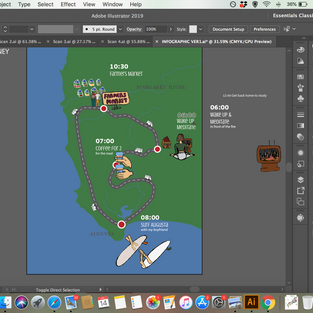
I decided to have the van as my dynamic flow guide, and have it going from one place to another and by seeing the direction it's going it's easy to see how things flow.
How to show time?
I was thinking to use a clock but wanted to explore bette when I see the layour with illustration and text
Hierarchy
I was thinking to have the title of act or story or location bigger then the illustartion and then the time, but wanted to explore better when I see it all on the layout.
Background
The map of Margaret River and Augusta regions
Title
My Saturday Morning Journey

Laying Out the Grid and Background
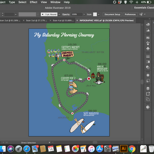
I wanted to start by laying my layout grid roughly on the background.
So initially I was using a vector of the world from this website as my background - On the location course they have referred a link to it)
But I haven't used at the end since I've realized I wanted to work on a way smaller scale of the map and this map was showing the whole of Australia.
I have started a new document with those dimensions, that I have found on this link speaking about the appropriate dimentions for infographics.
"horizontal orientations most common size is width and height of 1200 and 900 respectively."
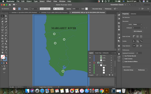
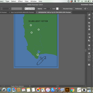
I have found a map of the 'cape to cape', which is showing the are we are living in at the moment, which is the little tip that is sticking out of southwest Australia.
I've started to draw the map using the reference of the 'Cape to Cape' map.
I have added the locations of my data, and spaced them a bit up because it doesn't have to be 100% accurate on a map like that.
I have added some rivers and the first title of Margaret river, I have used 'Caslon' font since I have read online (on google search) it's a common old map font and I wanted it to look a bit vintage.
Sketching the illustrations
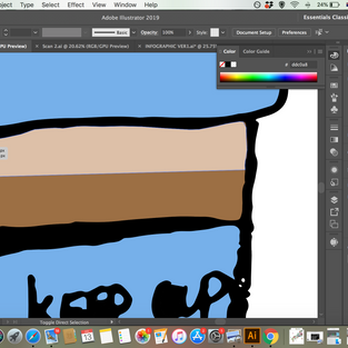
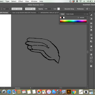
I have scanned my illustration pages and took it to illustrator to make them my vectors.
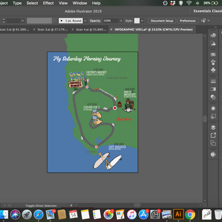
I have fixed them, while not fixing too much, I wanted to keep the naive sketching-illustration look, and I have colored them. I have also arranged the right illustrations in groups and placed them on my background to make sure they look good and to know better which colors should I choose.
Then I have started developing the map, even more, adding the roads, and preparing my data on the side to start using it on the map.
I knew now I will have to play more with the hierarchy and see what catches the eye and what needs to be larger or smaller. I thought to use the key on the left-hand side to save some space and for example, show our house or our van in there.
Then I was adding the text, I have checked few fonts and I decided to use
Allora for the title
Myriad bold for the time
Crushed Regular for the descriptions and locations
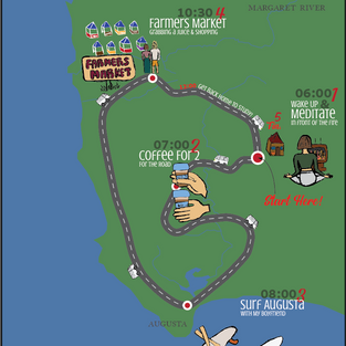
I was checking with my family to see readability and legibility, and also to see weather the story is understandable and dynamic in the right order. My dad was saying it wasn't too clear so I decided to add 2 more ways of understanding the flow -
adding "start here" and "fin"
adding numbers
I have used red colors as they are pretty bold and catch the eye, and then it actually looked a little bit like a game, and I liked it. So I decided to mark also the last stop's time with red as if "I'm running out of time" and also gave it the dynamics of being on the curvy road as if it's the car's smoke or sign of rush.
I have made my hierarchy as -
the title
the activity - while what's popping in our eyes at the same time is "start here" and the numbers of the stops.
the description / extra data is smaller and the reader can go more in-depth.
I have added a key so I don't need to explain too much on the map and the reader can understand better what is going on in the design.
Final Design

Mock-Up

REFLECTION
Such a fun project! I really enjoyed and pushed myself to sketch and it was so worth it! I really enjoy now to sketch, scan, and work with illustrator! I never thought I would. really grateful for this challenge and really impressed with my result!
I also learned so much from Skillshare courses again and I really like to see how my work progress.












































Comments