On this exercise I’ve been asked to create 10 abstract designs representing each city, as a cover for a travel guide for that city. I’ve been asked to balance blocks of subordinate, dominant and accent colours.
RESEARCH
I started by researching and reading about colours and how to tell a story with colours.
on this article - they explain very simply what is subordinate, dominant and accent colours.
1. Subordinate, or Base colour. This is a visually weak, or subordinate, colour. It should contrast or compliment the dominant colour.
2. Dominant. The main colour. It is this colour which defines the communicative values of the combination.
3. Accent, or Highlight colour. The Accent colour can be two things: either sympathetic to the Subordinate or Dominant colour, or it can be visually strong and striking, therefore appear to be competing with the dominant colour. This can provide tension within a combination
Also they explain how to present pallets
He talks about 5 different color combinations by topic.
All images from the article. All text summarised from the article.
Active / Vibrant -

feature bright, often complimentary, colours on the colour wheel. evoke feelings of noise, flamboyance and energy. It’s a young combination. they are intense tones of natural colours.
Muted / Calm -

have a lot of white in the hues. balanced and calming. Accent is almost always used as sympathetic to the Dominant. used in cosmetic industry. have a feminine quality.
Pastel -

similar to calm often based on colours containing a lot of white (or lack of white). combine warm and cool tones. youth and innocence.
Natural -

colours based on nature.Rusty reds, browns, sky blues and warm pinks.
Rich -

Hues of royalty, tradition, often religious and above all; wealth. Maroon is often mixed with gold and full shades of green.
CITIES
Now I can do my research about every city and check which category will fit in the best for each.
MADRID

MADRID INTERESTING FACTS -
I searched for interesting facts about Madrid, and started to mind map about Madrid. I thought Madrid is very passionate, and "Latina". in fact it is now the main airport that link flights from America Latina to Europe. Then I realised from this website
“Madrid is one of the four richest cities in Europe.”
“Situated at 650 meters above sea level, Madrid is the highest capital of Europe.”
“With 250 sunny days in year, Madrid is the sunniest city of Europe”
and that they have a real carnival once a year.
I was looking for pictures of Madrid and the symbol that I could repetitively see is the I found this really beautiful photo of Madrid.

MADRID COLOURS -
I found a cool application to check main colours on pictures -
https://colorgraphyapp.com/#/
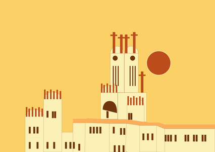
So I decided to use this photo I found and keep the colours that already exists on it. since it has very warm colours, Gold colour represent luxury and Madrid is the 4th rich city of Europe. Also the sunniest city, so yellow is a good colour.
I decided to use dominate colour as Golden Yellow - for royalty, then add to that light yellow- off white for the building since the buildings there have some kind of off-white colour. and also even though madrid is a big city, I think about calmness when I think about the architecture of it.

IN THE PROCESS -
FINAL DESIGN -

MALMO
Image source http://pixdaus.com/malmo-turning-torso-malmo-sweden-architecture/items/view/138470/#comment-form
Bridge image source - https://samsnotebook.typepad.com/sams_notebook/malm%25C3%25B6/
MALMO FACTS -
250 million people over the Öresund Bridge
Since the Öresund Link was opened in July 2000, 250 million people (October 2012) have travelled over this bridge between Malmö and Copenhagen.
Young inhabitants
Malmö residents from 177 countries
Cold weather
Sweden is very cold, therefore I thought about using very cold colours, also as pastel colour group is related to “young” feeling and as Swedish design is vey simple and plain I chose to use one of this photos and keep colours really pastel and cold.
MALMO COLOURS -
I was checking the colours from the actual photos I found
I thought to use the picture of the bridge as my inspiration but I thought that the image with the small houses will be a bit more of a challenge and also, it can represent the 177 countries that most of the residents of Malmo came from.

IN THE PROCESS -
FINAL DESIGN -

MANAGUA

MANAGUA PHOTOS -
Image Sources mentioned in the gallery
I really liked all the photos and couldn't really decide which one to pick. I realised the volcano is not exactly inside Managua so I didn't want it to be the main thing. Neither not another cathedral because its too easy (even though I like it and especially the palm trees on both sides of it).
MANAGUA FACTS -
From my research there are not too many interesting things about managua. But, the nearby volcano and lake are very important and known for the views from the city and defiantly something the residents are excited about,
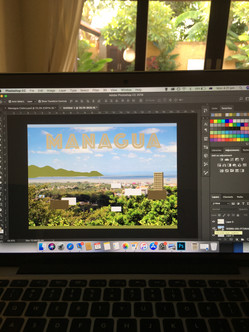
This is why I decided to use the photo that show the city, and the view (even tho I loved the market shot), as my inspiration.
I found out from the view shot, that the actual city is full of nature so I decided to give it a "natural" colour category.
Fact source - https://www.worldscapitalcities.com/capital-facts-for-managua-nicaragua/
MANAGUA COLOURS -
I could see the colour palettes are quite similar, natural based on blue and green.

IN THE PROCESS -
FINAL DESIGN -

MANCHESTER
MANCHESTER FACTS -
https://aspenwoolf.co.uk/13-facts-about-manchester/
https://www.visitmanchester.com/ideas-and-inspiration/it-all-starts-in-manchester/fun-facts-about-manchester
https://www.tarquinjones.com/12-facts-about-manchester/
I was first looking for some interesting facts about Manchester. I already know its known for Manchester United and the football but I've realised its known as the football capital of the world.
More then that, It was were the atom first split, Rolls Royce was created, Vegetarian started and its known for its Music scene.
When I think about Manchester I don't know why but the colours blue red white and yellow are coming into my mind, so I wanted to check the symbol of Manchester and see if there is any relation, and there is.

What was more interesting and I didn't know before is that its known for its "Curry Mile" where over 70 south asian restaurants are located within half a mile next to each other! I knew that will have to bring some accent of maybe green or red colours.
Manchester also began as a Roman Fort, and combine that fact with the well known Town Hall - off-white - creme colour will have to be involve in the design.

MIND MAPPING -

MANCHESTER PHOTOS -
Then I was looking for pictures and what I found other then a lot of photos of the Town Hall, was a lot of instagram travel guide such as "the most instagramable places in Manchester". So I checked it out.
https://www.bontraveler.com/the-first-timers-guide-to-manchester-england/
https://www.fashionedible.com/most-instagrammable-places-in-manchester-england/
https://www.readysetjetset.net/travel/manchester-instagram-spots
https://ckanani.com/blog/manchesters-king-street-townhouse-hotel
Obviously the photos were repeating themselves since everything Hyped on instagram is repeating itself, But this hotel view caught my eyes.
Manchester’s King Street Townhouse Hotel.
Image Sources mentioned on each photo
MANCHESTER COLOURS -
These are the colours I chose

IN THE PROCESS -
FINAL DESIGN -

MANHATTAN
MANHATTAN FACTS -
First I was looking for facts about manhattan on wikipedia and other websites.
I've realised from wikipedia Manhattan is actually the Cultural, Financial, Media and Entertainment capital of the world!
it is also called "the city" by the locals which obviously sent me to think about "sex and the city".
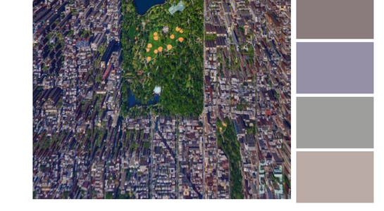
I was mind mapping about Manhattan and things that came in my mind were - yellow taxies, a lot of lights and squares, central park, buildings on water..
other fun facts I've found on this website
https://www.kickassfacts.com/25-kickass-and-interesting-facts-about-manhattan/
If everyone lived as densely as they do in Manhattan, the human race could fit in New Zealand.
A man once drunkenly stole a plane and landed it in the middle of Manhattan in front of the bar he had been drinking at. Two years later he did it again because someone doubted he had done it the first time.
In the mid-1970s, there were bars in Manhattan called juice bars that only served non-alcoholic drinks that catered to people who liked to dance on methaqualone (brand name Quaalude).
So basically it made me think Manhattan is a progressed city full of people and it seems a little bit like everyone is a little dot in the view but try to achieve "the American dream", want to be known, want to "make it".
MIND MAPPING -

PHOTOS OF MANHATTAN -
Image Sources mentioned inside
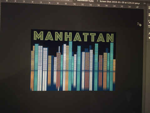
Vibrant colours would be perfect for it, but something in me wanted to have a dark background and play with the lights as dots - marking the insane amount of people, the business, the finance, entertainment, pleasures and a city that never stop and never goes to sleep.
MANHATTAN COLOURS -
I checked some colours from my reference photos for inspiration
These are the colours I chose :

IN THE PROCESS -
FINAL DESIGN -

Head to part B of the exercise >>














Comments