4.5.1 - Exercise: Lorem Ipsum
- Amber Houbara
- May 19, 2020
- 5 min read
Updated: Jan 6, 2021
Lorem Ipsum is dummy text with more-or-less normal distribution of letters that makes it look like readable English. It has been used for many years and some desktop publishing packages now use it as their default model text. If you don’t have it already, go to www.lipsum.com and generate as much as you need.
Now select one of the designs from your research that you like and think works.
Using the dummy text, try and copy the layout and design as closely as possible.
You will need to measure the margins and column widths.
If you don’t have the exact typeface get as near as you can.
If you are copying a page that includes photographs just leave 10% tinted boxes to indicate their position. Is the type serif or sans serif?
Is the text set ragged or justified?
Are there spaces after paragraphs or are new paragraphs indented?
How many columns are there to a page? What happens when you alter the fonts, change the alignment, adjust the leading or tracking?
Now try another, different publication from your collection.
My favorite design was ELLE magazine, so I chose to work with their design.
I've wanted to experiment with how close can I get to the original design.
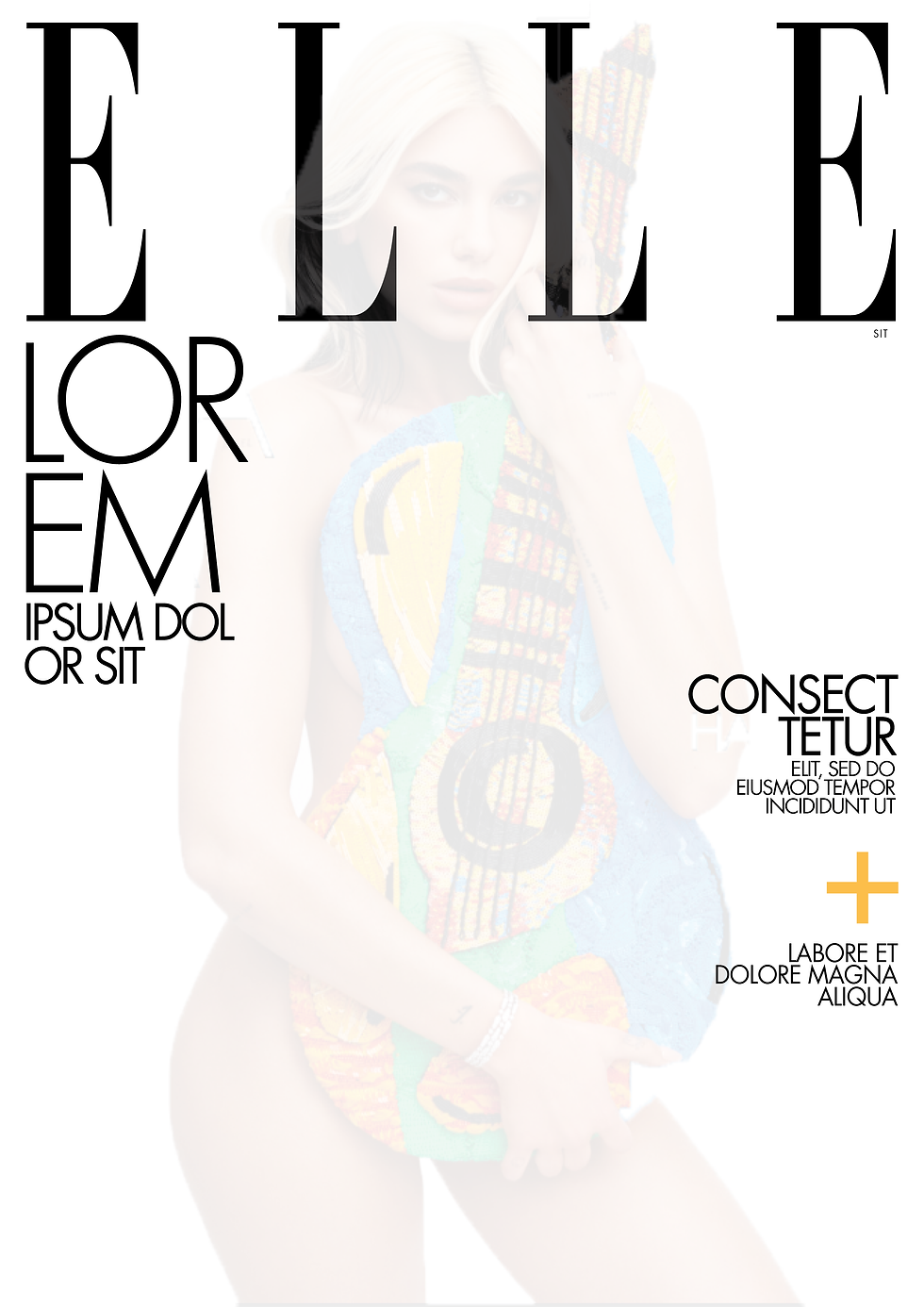
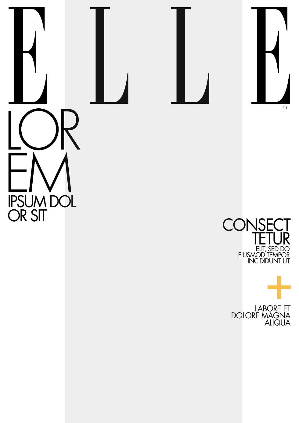
So I started experimenting with the cover first.
I checked the fonts, but the fonts Identifont have given me weren't close enough, so I've checked another website for identifying fonts, it was closer but not quite, so I have started a research to see what fonts do Elle magazine use.
I came across this really interesting article about fashin magazine's fonts
He also mentioned Elle magazine uses Didot as their font, but when I was trying to use 'Didot' and type 'Elle' it seemed like they either have a family of fonts or they have stretched the font up and spaced between the letter, So I started experimenting.
According to this article above, the sans serif font they are using is 'Futura', another one the other identifying fonts websites didn't quite find, My fonts did find something similar but I already had Futura on my computer so it was easier to work with it. I realized that the 'Futura' I have on my computer is a heavier weight font from the same family so I was looking for the lighter version of it.
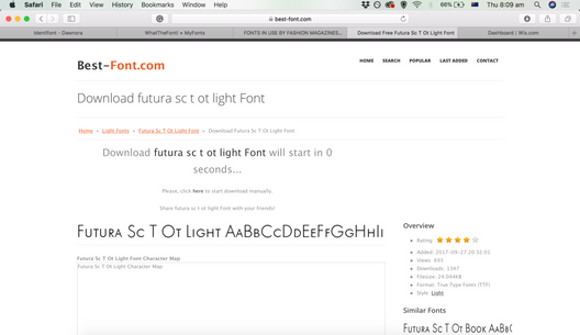
I have found this website so I can download free fonts - for personal use
Then I started placing the text and image at the same spots, just according to my eyesight before I measure.
Then I have started to measure the distances between letters, words, and the hights of the letters too. To get as close as I can, I used the actual text they have used.
- Again, I'm only experimenting here before I go to design the layout of the article.
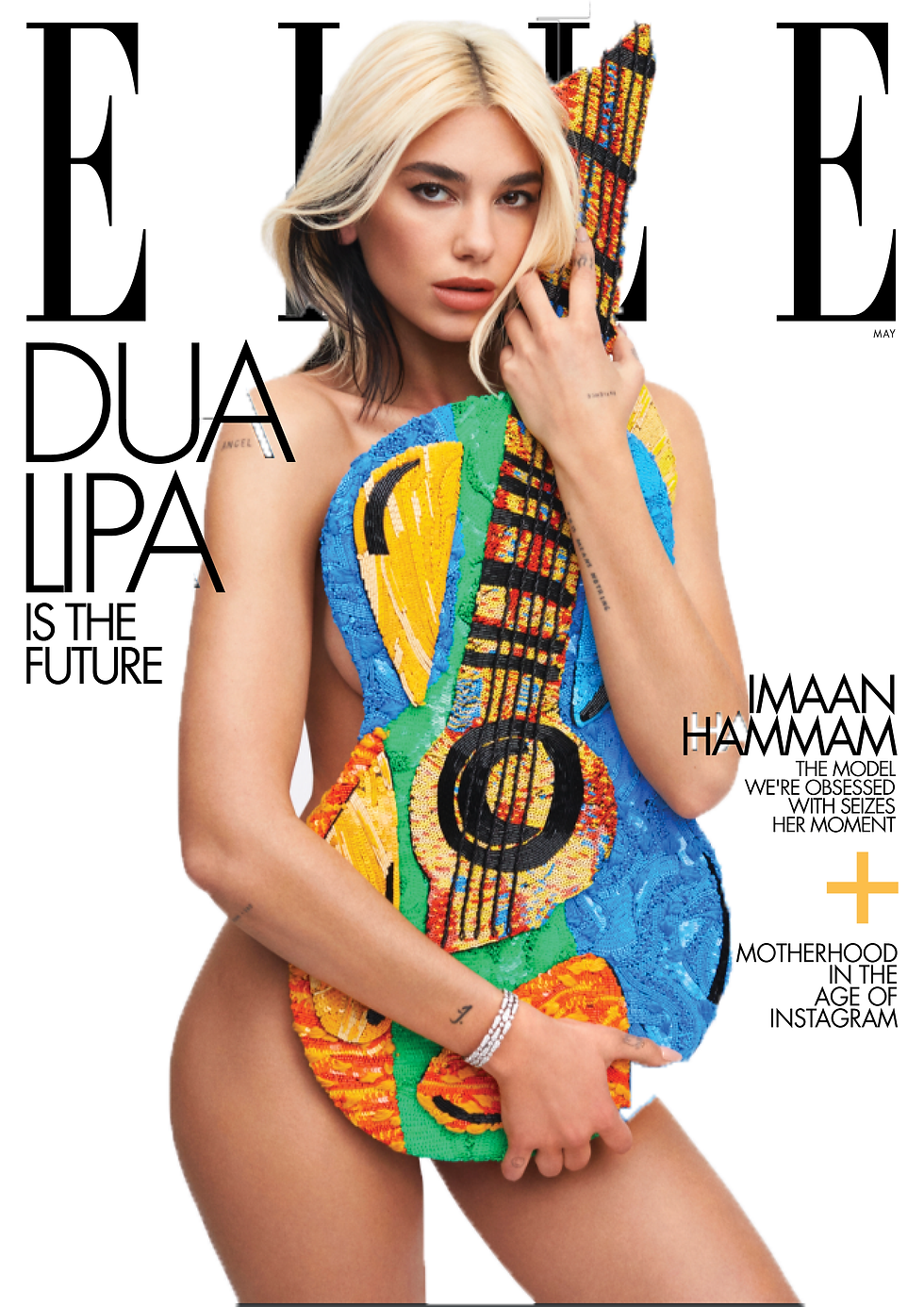

Using Lorem Ipsum
Using other layouts of the same magazine -
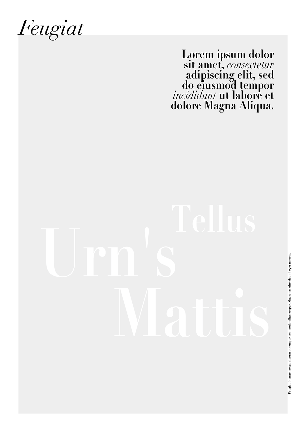
Inside Cover Page

Measuring again the right margins and column widths.
Similar to the cover page, I already know Elle magazine are using a serif font - 'Didot'. But in this specific 'inside cover' page, they are using some kind of font which is very similar but more sophisticated. Unfortunatly I couldn't detect the exact one - it could be a personal font of the Didot family which was formed specifically for Elle, of just a more decorated version of the same family.
I chose to use 'Didot' anyway since it's the closest I've had.
I had to stretch all paragraphs pretty much 110% to match the size.
In this case the paragraph is only one - one title one subtitle and one text box so there are no spaces after paragraphs.
I had to minimize the leading of the text box to match it to the original layout.
The text box text is ragged.
Article Page

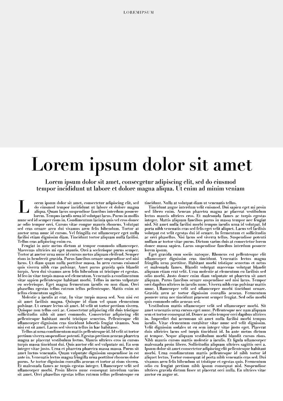
Same like the previous design, I have used Didot font which is a serif font.
The text is justified, so it's stretched all the way to fit the columns
There are no spaces between paragraphs but there is a first-line indent
There are 2 columns to the page.
In addition there is a drop cap with space around it.
What happens when you alter the fonts, change the alignment, adjust the leading or tracking?
I tried to change and play around with fonts and alignments.
I surprisingly liked the fact I was aligning the text on the left to the center, I thought it would look odd.
I tried to add a different font - ' Times' which is not sans serif like 'futura'.
Surprisingly it's not looking bad, but I dont like the fact there are 3 different fonts on the same cover.
So I would have prefer the original design.
Example 1
First I was looking to change the text box text to the center, It didnt look bad, but I did prefer the original alignment to the right, since the text box is on the right hand side.
Example 2
I was trying to align it to center but this time to be justified, It looked too square to me.
Example 3
I tried to align the text to the left, but it looked pretty weird since the location of the text box was on the right.
Example 4
Since I have aligned the text to the left, I thought to actually move the text box down to the bottom left, and see how it looks there.
I actaully liked it, and therefore played around with placing it on top of the bottom half of the title.
Example 5
I wanted to see how would it be to change the fonts on a part of the title, I didn't like it as I expected.
Example 6
After trying to change the font of the title, and not really liking it. I thought it can be a great idea to change the text of the subtitle (on the top left) which actaully came out pretty good in my eyes!
In conclusion
I liked the original layout, but I think I have come up with a cool alternative for an 'inside cover' layout.
Example 1
I changed the text to be ragged
Example 2
Changed the font to sans serif
I didn't like it since it was too hard to read so much text with sans serif
Example 3
Change the font to different serif ('Alice')
Changed the alignment of the title and the subtitle to left
Example 4
Changed the font to 'Alice' in title and subtitle too. Changed the leading to a smalled size. Also aligned the text to be justified again.
It felt too small to read.
Example 5
Made the leading to be larger then normal
Example 6
brought back to normal leading, Kept it all with Alice serif font
In conclusion
I think that when it's a large amount of text, it is important to keep everything very neat.
The columns are good but it's better for the text to be justified if there is more then 1 column.
The best font for large amount of text is usually serif, it's easier for the eye to read smaller letters and bit amount of them. It is also pretty good to have enough space between the lines (leading) so it's not too condense to the eye.
REFLECTION
As mentioned before, I really like layout and magazine/ book design so it was so much fun and so interesting to finally learn more about magazine design, it was fun to copy the magazines layouts and figure out the typefaces they are using.
I really leaned a lot from it and I can see how fun it will be to create more book / magazine design layouts!













Comments